Many therapists invest time and money into building a professional website — and then wonder why it isn’t bringing in consistent client inquiries.
If you’ve ever thought:
- “I have a therapy website, but I’m not getting many calls.”
- “People visit, but they don’t reach out.”
- “I’m not sure what’s wrong with my site.”
You’re not alone.
In most cases, the problem isn’t your credentials, your niche, or your clinical ability.
It’s structure.
When someone lands on your therapy website, they aren’t reading every word carefully. They are scanning for reassurance. They are asking themselves:
- Do I feel understood here?
- Does this therapist seem grounded and competent?
- Is it easy to take the next step?
- Will reaching out feel safe?
If your website doesn’t answer those questions quickly, visitors leave — even if you are an excellent clinician.
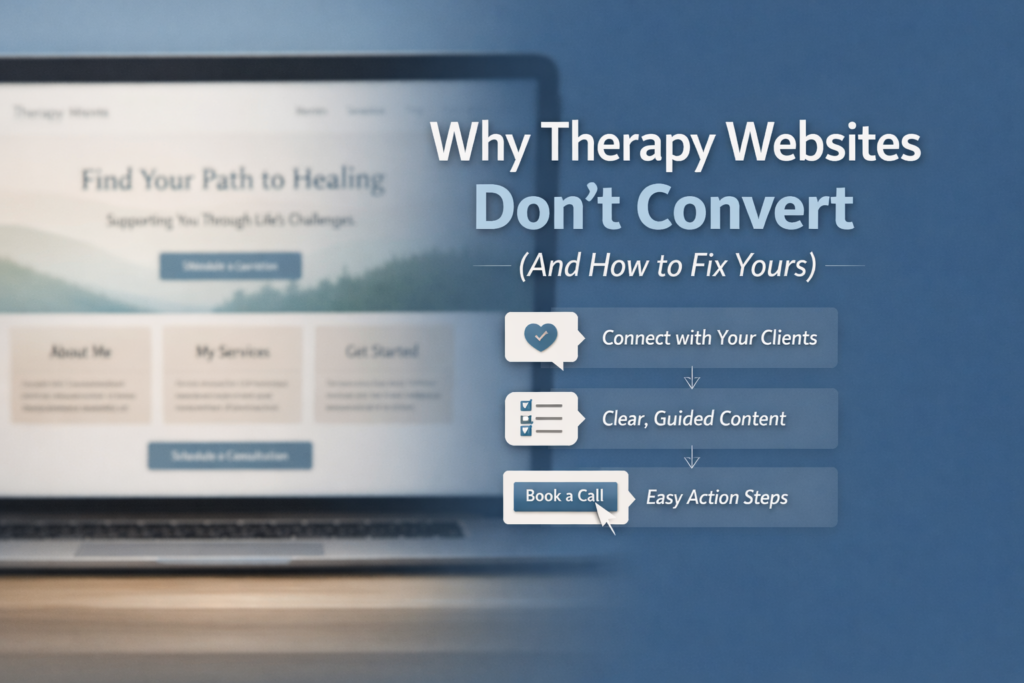
Here are the most common reasons therapy websites don’t convert, and what you can do to fix them.
1. Your Homepage Doesn’t Speak to the Client’s Experience
Many therapist websites open with something like:
“Welcome to my practice.”
While warm, it doesn’t immediately reflect what the visitor is feeling.
A high-converting therapy website begins with resonance. It mirrors the client’s internal world:
- Feeling overwhelmed
- Struggling in relationships
- Experiencing anxiety or burnout
- Looking for clarity or support
Clients make fast emotional decisions. If your homepage doesn’t quickly reflect their experience, they may leave before reading your bio.
Fix: Lead with a clear, emotionally grounded headline that reflects the specific clients you serve.
2. The Layout Is Unstructured or Overwhelming
One of the most common therapy website design mistakes is long blocks of text.
Even thoughtful content becomes overwhelming when it lacks structure.
Visitors — especially those already feeling anxious — skim first and read later.
Strong therapy website design includes:
- Clear section breaks
- Focused headlines
- Short paragraphs
- Logical page flow
- Generous white space
Structure builds subconscious trust. When your site feels organized and intentional, visitors associate that with professionalism and stability.
Fix: Break content into digestible sections. Guide the reader through a clear, calm flow.
3. There’s No Clear Next Step
Passive calls to action reduce conversions.
Phrases like:
“Feel free to reach out.”
Or:
“Contact me if you’d like.”
Create hesitation.
Someone considering therapy is often already uncertain. Vague language increases that uncertainty.
High-converting therapy websites make the next step obvious:
- Schedule a free consultation
- Book a 15-minute call
- Send a secure message
Clarity lowers emotional friction.
Fix: Place a clear call to action near the top of your homepage and repeat it throughout the page.
4. The Website Feels Generic
Drag-and-drop templates make building a therapy website easier, but they often lack intentional structure.
Visitors may not consciously recognize a template, but they do sense when a site feels assembled rather than thoughtfully designed.
A therapy website that converts is structured around the client journey:
- Clear service breakdowns
- Defined specialties
- Simple navigation
- Practical information presented clearly
When structure reflects how therapy actually works, trust increases.
Fix: Build your website around the therapeutic process, not just visual aesthetics.
5. Important Information Is Hard to Find
Many visitors are scanning quickly for:
- Insurance details
- Availability
- Telehealth options
- Office location
- Contact information
If this information is buried, unclear, or difficult to locate, potential clients may move on.
Fix: Create clearly labeled sections for practical details. Make it easy for someone to get the information they need without searching.
What Actually Makes a Therapy Website Convert?
High-performing therapy websites share a few consistent characteristics:
- Clear emotional positioning from the first screen
- Structured, readable layout
- Calm and professional visual tone
- Obvious next steps
- Easy access to practical information
It’s not about flashy design.
It’s about psychological safety.
Your website is often the first therapeutic interaction someone has with you.
Before they call.
Before they schedule.
Before they sit across from you.
If that first interaction feels confusing or cluttered, trust is harder to build.
If it feels structured and intentional, trust builds quietly.
A Quick Self-Assessment
Ask yourself:
If a new client landed on my homepage for 15 seconds, would they:
- Know who I help?
- Feel emotionally understood?
- See a clear next step?
If the answer is unclear, your website may need structural refinement — not more content.
Want to See What Structured Therapy Website Design Looks Like?
If you’d rather not navigate layout decisions alone, you can explore how structured, therapist-informed website design works here:
Frequently Asked Questions About Therapy Website Design
What should a therapist website include?
At minimum: a clear homepage message, services overview, therapist bio, contact page, insurance information, and a strong call to action.
How long should a therapy homepage be?
Long enough to guide a visitor through understanding who you help and how to contact you — but structured clearly with headings and sections.
Do therapists need a blog?
A blog can help improve visibility in search engines and build authority, but only if posts are strategic and focused on client questions.
About the Author
Mark is the founder of TherapyBuilt and a Master of Social Work candidate at New Mexico Highlands University. He builds structured websites specifically for private practice therapists who want a calm, professional online presence without navigating technical overwhelm.
Last updated: February 24, 2026