
Prickly Pear Therapy
A calm, welcoming website for a Rio Rancho therapy practice serving couples, individuals, and children — designed to make it easier for prospective clients to understand the practice, explore care options, and take the next step.
The Practice
Prickly Pear Therapy provides counseling for couples, individuals, and children in Rio Rancho, New Mexico.
The website needed to feel warm and approachable while still giving prospective clients the practical information they need before deciding whether to reach out.
That meant designing something that felt like a therapy practice rather than a generic small-business website.
The goal was not simply to create a beautiful homepage. The website needed to help someone quickly understand who the practice serves, what support is available, who they may be working with, and how to request an appointment.
What the Website Needed to Do
Prospective therapy clients often arrive at a website with very different questions than someone shopping for a typical product or service.
They may be trying to decide whether the therapist understands what they are experiencing, whether the practice works with people like them, what care may cost, and whether reaching out feels comfortable.
The site needed to make it easy to understand:
- Who Prickly Pear Therapy serves
- The types of therapy and support available
- Who the clinicians are
- What the practice feels like
- Fees and insurance information
- Information clients may need before beginning therapy
- How to request an appointment
A Calm First Impression
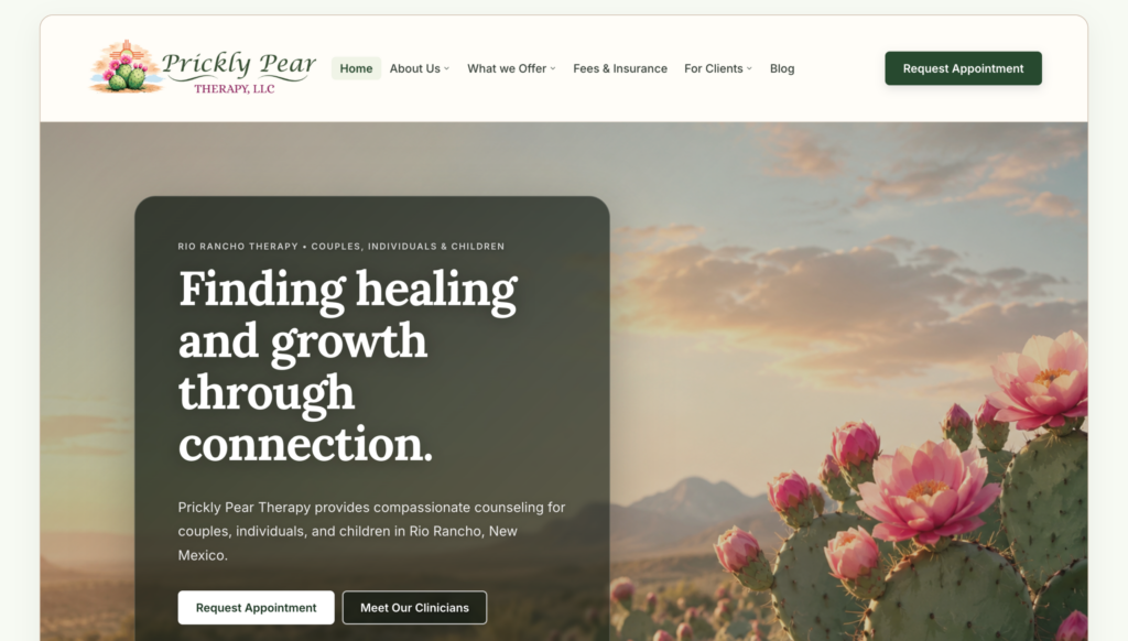
The visual direction uses warm natural tones, desert imagery, greenery, soft cream backgrounds, and deep green accents.
The large opening image connects the site to New Mexico without turning the design into a Southwestern theme. The dark translucent content panel creates enough contrast for the message to remain easy to read while allowing the landscape to remain part of the experience.
The headline — Finding healing and growth through connection. — gives the homepage an emotional center without trying to oversell therapy or promise an outcome.
Warm, Not Clinical
Natural imagery, soft colors, generous spacing, and restrained typography help the site feel approachable rather than institutional.
Clear, Not Overwhelming
The navigation and homepage hierarchy give visitors obvious places to learn about services, clinicians, fees, client information, and appointments.
Built Around the Questions Therapy Clients Ask
One of the biggest differences between a therapist website and a generic business template is the sequence of information.
A prospective client usually does not arrive ready to immediately purchase something. They are gathering information and deciding whether the practice feels appropriate for them.
Prickly Pear Therapy’s website structure follows that decision process rather than forcing every piece of information onto the homepage.
Navigation With a Purpose
The main navigation stays deliberately simple:
- Home — establishes the practice and the primary path forward
- About Us — introduces the people behind the practice
- What We Offer — organizes therapy services
- Fees & Insurance — answers an important practical question early
- For Clients — gives current and prospective clients useful information
- Blog — provides room for educational and search-focused content
The primary Request Appointment button remains visually separate from the navigation so someone who is already ready to reach out does not have to search for the next step.
Design Supporting the Content
A common mistake in therapy website design is treating appearance as the entire project.
The Prickly Pear design uses visual elements to support the content hierarchy rather than compete with it.
Typography
A character-rich serif headline provides warmth and personality, while clean sans-serif body text keeps practical information easy to read.
Color
Forest greens, warm neutrals, and muted natural tones reinforce the practice identity without overwhelming the content.
Calls to Action
Appointment buttons are prominent and consistent without turning the website into an aggressive sales funnel.
Spacing
Generous whitespace separates ideas and gives visitors room to process information instead of confronting them with dense blocks of content.
Local Relevance Without Keyword Stuffing
The homepage immediately identifies Prickly Pear Therapy as a Rio Rancho therapy practice and describes the populations it serves.
That matters for prospective clients, but it also gives search engines clear context about the practice, its location, and its services.
Good local SEO should also be good communication. A visitor should never feel like they are reading a page written for Google instead of for them.
The Result
The finished website gives Prickly Pear Therapy a professional online home that feels specific to the practice rather than assembled from a generic therapy template.
What the finished site establishes
That is the goal of TherapyBuilt: not simply to launch a good-looking therapist website, but to give a practice a digital foundation that can continue working as the practice grows.
A Website That Feels Like the Practice
Therapy is personal. The website representing a therapy practice should feel personal too.
Prickly Pear Therapy combines a distinct visual identity with a practical structure designed around prospective clients. The result feels warm, professional, grounded, and easy to navigate without becoming overly clinical or overly promotional.
Need a Website Built Around Your Practice?
TherapyBuilt creates calm, professional WordPress websites specifically for therapists and private practices. We handle the structure, writing, design, and technical work so your website reflects your practice and makes the next step clear for prospective clients.
Check Fit